Decoding the Right Font Size: A Guide to Letter Sizing
Ever stared blankly at your screen, paralyzed by the sheer tyranny of font size options? It's a modern-day dilemma, like choosing the right filter for your avocado toast or the perfect shade of blush for your Zoom meeting. But the quest for the perfect letter dimensions is no trivial pursuit. It’s about more than just aesthetics; it's about communication, accessibility, and frankly, not giving your readers a migraine.
The "correct" font size for a letter is less a hard and fast rule and more a nuanced conversation. It’s a dance between readability, the medium you’re working with, and the overall vibe you're trying to convey. Are we talking about a handwritten thank you note, a professional email, or a billboard on Sunset Boulevard? The context matters, people.
Historically, the concept of standardized font sizes didn't really exist. Before the advent of printing, scribes and calligraphers wielded their quills with artistic license, the size of their lettering dictated by the medium (parchment versus stone) and the purpose of the text (sacred scriptures versus grocery lists). With the rise of the printing press, the need for uniformity emerged, eventually giving us standardized point sizes that we grapple with today.
But choosing an appropriate character size isn't just a throwback to Gutenberg. It’s crucial for effective communication. A poorly chosen font size can render your message illegible, alienate your audience, or worse, convey a completely different message than intended. Imagine a wedding invitation in size 8 font – chic? No, just frustrating.
So, what’s the magic number? Well, there isn’t one. But understanding the factors that influence optimal letter sizing can help you navigate this typographical minefield. Think of it as your personal decoder ring for the world of fonts. We’ll delve into those factors, providing you with the knowledge to choose the right size for every letter, every time.
Typically, for body text in printed materials, a font size between 10 and 12 points is considered standard for comfortable reading. For digital mediums, the sweet spot tends to be slightly larger, around 12-14 points, to account for varying screen resolutions and reading distances. For headings, larger sizes are naturally preferable, with 18-24 points common for subheadings and even larger for titles.
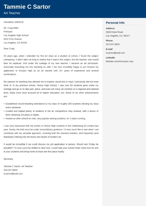
One practical example is a business letter. Opting for a font size of 12 points ensures professionalism and readability. Conversely, a children's book might utilize larger font sizes, perhaps 16-18 points, to accommodate young readers. Websites often use a base font size of 16px for body text, adapting to different screen sizes using responsive design. Posters and signage, designed to be viewed from a distance, require significantly larger font sizes, sometimes exceeding 72 points.
Some best practices for choosing an appropriate typeface size include considering your audience (age, visual abilities), the medium (print, digital, large format), and the purpose of the text (informative, decorative, persuasive). Testing different sizes and soliciting feedback can also be invaluable. Additionally, maintaining consistent font sizing throughout a document or project ensures a professional and cohesive look.
Advantages and Disadvantages of Different Font Sizes
| Font Size | Advantages | Disadvantages |
|---|---|---|
| Small (e.g., 8pt) | Fits more text in a limited space. | Can be difficult to read, especially for those with visual impairments. |
| Medium (e.g., 12pt) | Good balance between readability and space efficiency. | May not be impactful enough for headings or large displays. |
| Large (e.g., 16pt+) | Easy to read, especially from a distance. Ideal for headings and displays. | Takes up more space, may require more pages or larger displays. |
FAQ:
What is the best font size for a resume? (Generally 10-12pt)
What is the ideal font size for an email? (12-14pt)
What font size should I use for a website? (16px for body text is a common starting point)
How does font size affect readability? (Smaller sizes can strain the eyes, while larger sizes can be overwhelming if used inappropriately)
What is point size? (A unit of measurement for font size)
What is pixel size? (A unit of measurement for font size in digital mediums)
What is the standard font size for books? (Typically 10-12pt)
How do I choose the right font size for my project? (Consider your audience, medium, and purpose)
Mastering the art of font sizing is like finding the perfect pair of jeans – it can take some trial and error, but once you find the right fit, it makes all the difference. By understanding the principles of readability, considering your audience and purpose, and experimenting with different options, you can ensure your message is communicated clearly and effectively. From professional emails to captivating posters, the right font size can elevate your work and make a lasting impression. So, take the time to consider this seemingly small detail; you might be surprised at the impact it can have.

Online Letter Stencils Free Printable Free Printable | YonathAn-Avis Hai

Floral font Letter M Stock Vector Image Art | YonathAn-Avis Hai

Striped Font Letter E Calligraphy Sketch Illustration Vector | YonathAn-Avis Hai

3d Font Letter T Monogram Typeset Lowercase Vector Monogram Typeset | YonathAn-Avis Hai

Best Font For Job Application at Beatrice Tapley blog | YonathAn-Avis Hai

Incredible Largest Font Style Simple Ideas | YonathAn-Avis Hai

Get reading and language support in Microsoft | YonathAn-Avis Hai

Font Size For Print | YonathAn-Avis Hai

Unique font design on Craiyon | YonathAn-Avis Hai

Salon Suites Palm Tree Sign 3D Raised Text Custom Colors Size Font Let | YonathAn-Avis Hai

Best Cover Letter Font You Should Use Size Typeface | YonathAn-Avis Hai

Best Font Style In Resume at Josephine Caldwell blog | YonathAn-Avis Hai

Format For Font Size | YonathAn-Avis Hai

what size font for letter | YonathAn-Avis Hai

what size font for letter | YonathAn-Avis Hai