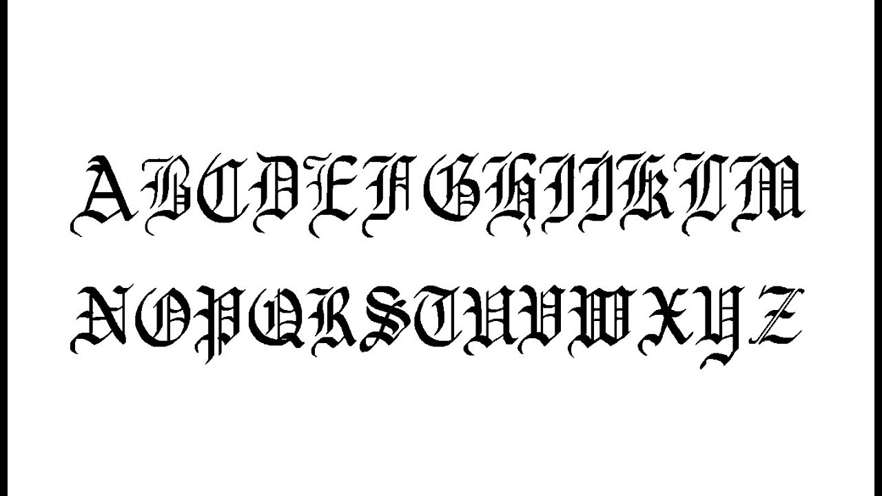
The Enduring Allure of Blackletter Fonts
Walking down the street, one can't help but notice the way a particular storefront sign, etched in a bold, angular script, draws the eye. It's a look that speaks of history, of tradition, whispering tales of illuminated manuscripts and ancient craft. This captivating aesthetic is often achieved through the use of blackletter fonts, a style that evokes a sense of the medieval and the timeless.
Though many associate this style with "Old English," the reality is far more nuanced. Blackletter fonts, characterized by their thick, angular strokes and elaborate, sometimes ornate letterforms, have a rich history that extends far beyond any single language or time period. Their roots lie in the scripts used by scribes in medieval Europe, evolving over centuries to take on distinct forms in different regions.
One of the more widely recognized examples, often mistaken as "Old English" by the general public, is actually a typeface called Old English Text MT. While this specific font draws inspiration from the broader blackletter family, it is just one interpretation within a vast and varied typographic landscape.
The enduring appeal of blackletter fonts, and those that share similarities with Old English Text MT, lies in their ability to instantly transport the viewer. Whether gracing a book cover, emblazoned on a band's logo, or carefully chosen for a brand identity, these fonts carry an undeniable weight. They speak of craftsmanship, of heritage, and of a certain reverence for the past.
However, their use is not without its considerations. The very qualities that make them so visually striking can also pose challenges in terms of legibility, particularly at smaller sizes or in large blocks of text. This is where a discerning eye and a thoughtful approach become paramount. Just as one wouldn't wear a three-piece suit to a casual gathering, blackletter fonts demand a certain respect and understanding of their strengths and limitations.
Advantages and Disadvantages of Blackletter Fonts
| Advantages | Disadvantages |
|---|---|
| Visually striking and attention-grabbing | Can be difficult to read at small sizes |
| Convey a sense of history, tradition, and craftsmanship | May not be suitable for all types of content or audiences |
| Highly distinctive and memorable | Overuse can appear cliché or gimmicky |
When thoughtfully deployed, blackletter fonts and those resembling Old English Text MT offer a powerful tool for visual storytelling. They invite us to pause, to take notice, and to connect with a heritage that stretches back through the centuries.

font similar to old english text mt | YonathAn-Avis Hai

Free Calligraphy Tutorial Pdf Free Download | YonathAn-Avis Hai

font similar to old english text mt | YonathAn-Avis Hai

font similar to old english text mt | YonathAn-Avis Hai

font similar to old english text mt | YonathAn-Avis Hai

Pin on Things you should do! | YonathAn-Avis Hai

font similar to old english text mt | YonathAn-Avis Hai

font similar to old english text mt | YonathAn-Avis Hai

font similar to old english text mt | YonathAn-Avis Hai

font similar to old english text mt | YonathAn-Avis Hai

font similar to old english text mt | YonathAn-Avis Hai

font similar to old english text mt | YonathAn-Avis Hai

font similar to old english text mt | YonathAn-Avis Hai

font similar to old english text mt | YonathAn-Avis Hai

font similar to old english text mt | YonathAn-Avis Hai