Unlocking Scalable Typography: Mastering CSS Font Size with Em Units
Ever wondered how to create websites with text that scales beautifully across different devices and browsers? The secret lies in understanding and effectively using the `em` unit for CSS font sizing. This powerful unit offers flexibility and accessibility advantages that pixel-based sizing simply can't match. This article dives deep into the world of `em` units, empowering you to create responsive and user-friendly web experiences.
CSS, or Cascading Style Sheets, dictates the visual presentation of web pages. Font size, a crucial aspect of this presentation, can be controlled with various units, including pixels, points, and ems. While pixels offer precise control, they lack flexibility, creating potential accessibility issues. `Em` units, however, provide a relative sizing mechanism, making them a preferred choice for responsive web design.
The `em` unit's history is intertwined with traditional typography. Originally, an "em" referred to the width of a capital "M" in a given typeface. In the digital realm, `em` inherits this relative nature, representing a multiple of the font size of the parent element. This inheritance is key to its scalability: changing the base font size automatically adjusts all font sizes defined in `em` units, maintaining consistent proportions.
The importance of `em` units stems from their inherent accessibility. Users with visual impairments often adjust browser font sizes to improve readability. With pixel-based sizing, this can lead to layout issues and overlapping content. `Em` units, being relative, respect user preferences, ensuring that text remains proportional and readable even when the base font size is changed. A common issue with `em` units is the compounding effect. Since they are relative to the parent element's font size, nested elements using `em` units can lead to unexpectedly large or small text if not carefully managed.
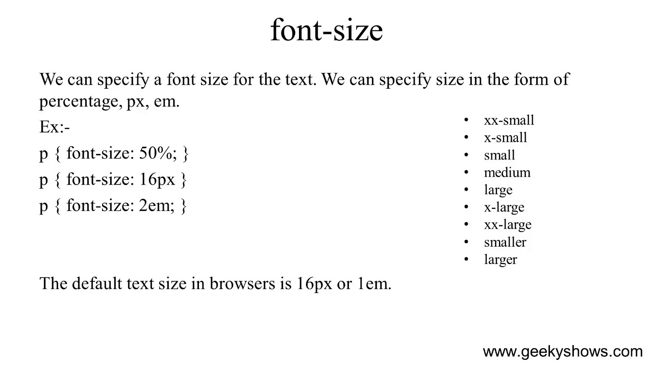
Simply put, an `em` unit is equal to the current font size of the element. If the parent element has a font size of 16px, 1em is equivalent to 16px, 2em to 32px, and 0.5em to 8px. For example: `p { font-size: 1.2em; }` This sets the paragraph font size to 1.2 times the font size of its parent element.
Benefits of using em units:
1. Scalability: Easily adjust overall text size by changing the base font size, ensuring consistent proportions across all elements.
2. Accessibility: Respects user browser font size preferences, improving readability for visually impaired users.
3. Maintainability: Simplifies font size management, reducing the need for extensive pixel-based adjustments.
Action Plan for Implementing Em Units:
1. Set a base font size for the `body` element (e.g., `body { font-size: 16px; }`).
2. Use `em` units for all other font sizes (e.g., `h1 { font-size: 2em; }`, `p { font-size: 1.2em; }`).
3. Test across different browsers and devices to ensure consistent rendering.
Advantages and Disadvantages of Using Em Units
| Advantages | Disadvantages |
|---|---|
| Scalability and responsiveness | Compounding can be complex |
| Improved accessibility | Requires careful planning and testing |
| Easier maintenance | Can be initially challenging to grasp |
Best Practices
1. Start with a base font size in pixels for the body element.
2. Use ems for all other elements, including headings, paragraphs, and other text containers.
3. Be mindful of nesting and the compounding effect of ems.
4. Test thoroughly across different browsers and devices.
5. Use a CSS reset or normalize stylesheet to minimize browser inconsistencies.
FAQ
1. What is the difference between em and rem units? (Rem units are relative to the root font size.)
2. How do I calculate em values? (Multiply the desired font size by the parent's font size.)
3. Can I use ems for other CSS properties? (Yes, but it's primarily used for font sizes.)
4. Are there any browser compatibility issues with ems? (No, ems are widely supported.)
5. What are some common mistakes when using ems? (Not setting a base font size and improper nesting.)
6. How can I debug em-related issues? (Use browser developer tools to inspect element styles.)
7. What are the best resources for learning more about ems? (MDN Web Docs, CSS-Tricks)
8. How do ems contribute to responsive design? (They allow text to scale proportionally with screen size.)
In conclusion, mastering CSS font sizing with `em` units is essential for building modern, accessible, and responsive websites. While there might be a slight learning curve, the benefits of scalability, accessibility, and maintainability far outweigh the initial challenges. By understanding the relative nature of `em` units, their inheritance model, and best practices for implementation, you can unlock the true potential of web typography. Start using `em` units today and create websites that look great and function flawlessly on any device, ensuring a positive user experience for everyone.

Robertsondev Font Size Comparison Chart Images | YonathAn-Avis Hai

css font size em | YonathAn-Avis Hai

How to decide CSS units for responsive website | YonathAn-Avis Hai

css font size em | YonathAn-Avis Hai

Specifico Raramente cartellone em tag css serbatoio Collide costruzione | YonathAn-Avis Hai

css font size em | YonathAn-Avis Hai

CSS HTML Font Size Property in px pt percent em responsive Values | YonathAn-Avis Hai

css font size em | YonathAn-Avis Hai

css font size em | YonathAn-Avis Hai

CSS Font Size CSS Font Size em | YonathAn-Avis Hai

css font size em | YonathAn-Avis Hai

CSS Font Size With Examples | YonathAn-Avis Hai

css font size em | YonathAn-Avis Hai

css font size em | YonathAn-Avis Hai
css font size em | YonathAn-Avis Hai